Yes, I know it has been a long time coming, but we are here now.
How would you like to see Evolving Solutions on the web?
Please share your favourite design in the comments and thank you!
Option #1

Option #2

Option #3
Yes, I know it has been a long time coming, but we are here now.
How would you like to see Evolving Solutions on the web?
Please share your favourite design in the comments and thank you!
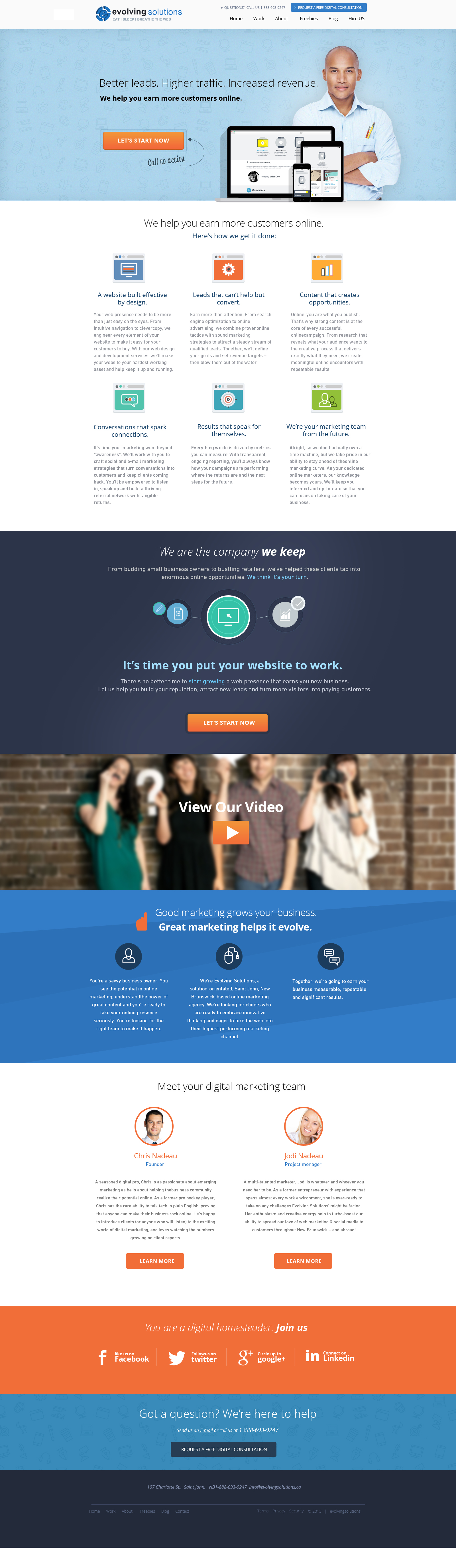
Option #1
Option #2
Option #3

My pick would be option # 1. A combination of professionalism and fun-loving flair. That’s how I see you two crazy kids!
Thanks Charlotte!
I like option #1 the best Chris, it breaks your content into nice digestible chunks – easy to read. Good luck with the re-design!
Thanks Mike and great to have your input!
#1 for sure. #3 is 2nd. #2 doesn’t do anything for me.
Cheers
Thanks dude!
Option #1 without a doubt.
Keith I like your confidence! 🙂 Thank you.
Option #1 – it seems to be more “User Friendly” and “client centric”. Phewf – I hit my buzzword quota for the day 😉
Thanks.ca 🙂
#1 is my pick. The only thing I wasn’t crazy about in #1 were the 6 icons under ‘Here’s how we get it done’. The circular shape, I like.. they just seem too big or too cartoon-like or something. I tried not to like #1 the best because of this and really took a closer look at #3 (#2 was too plain and simple for your business, I thought). In the end, #1 is the best – and maybe those icons work and I am just being silly.
Thanks for the feedback Shelley. I know what you are saying. 😉
Hey, Chris,
I was just a-perusin’ and wanted to say these all look really cool!! I’m with the majority that option #1 is my favourite. On the opening page, I think the image of the hand holding the mobile was more instantly relatable than the pics of the two fellows. (I find that in general when using a pic of a single person vs. a group of people/other image. Maybe it’s a subconscious thing – I don’t work with people wearing suits or who keep pencils in their shirt pockets… 🙂 )
I agree with a previous poster re: the circle icons. I prefer the rectangular icons in #3 bc they make a little more sense to me.
Ok… one last thing… under ‘meet the team,’ #1 has buttons for ‘hire chris/jodi” and #3 says ‘learn more’… I like #3 unless you are wanting people to individually hire y’guys.
Overall, love the clean, sleek look. Very effective!
Lilli
Awesome feedback Lilli! Thanks.